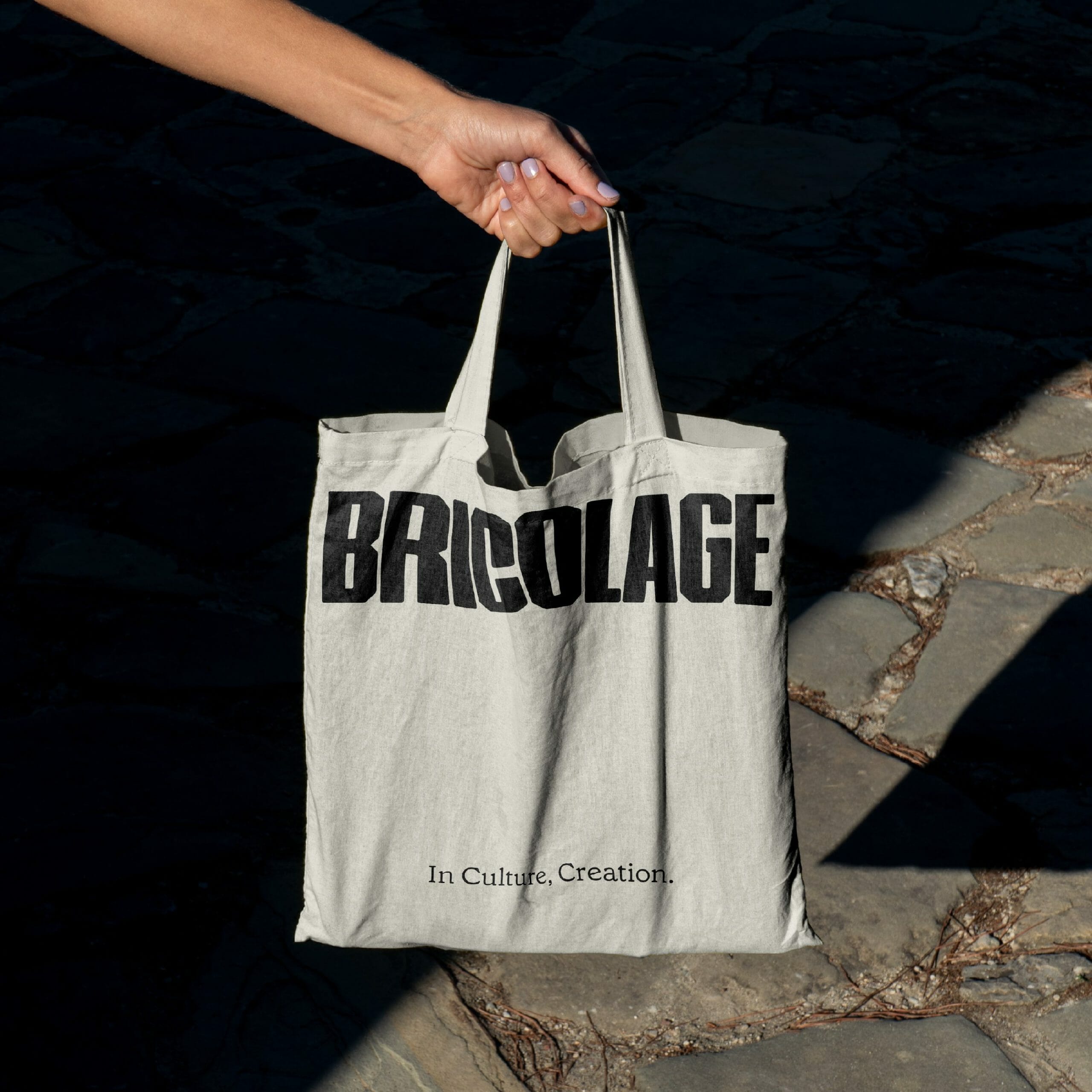
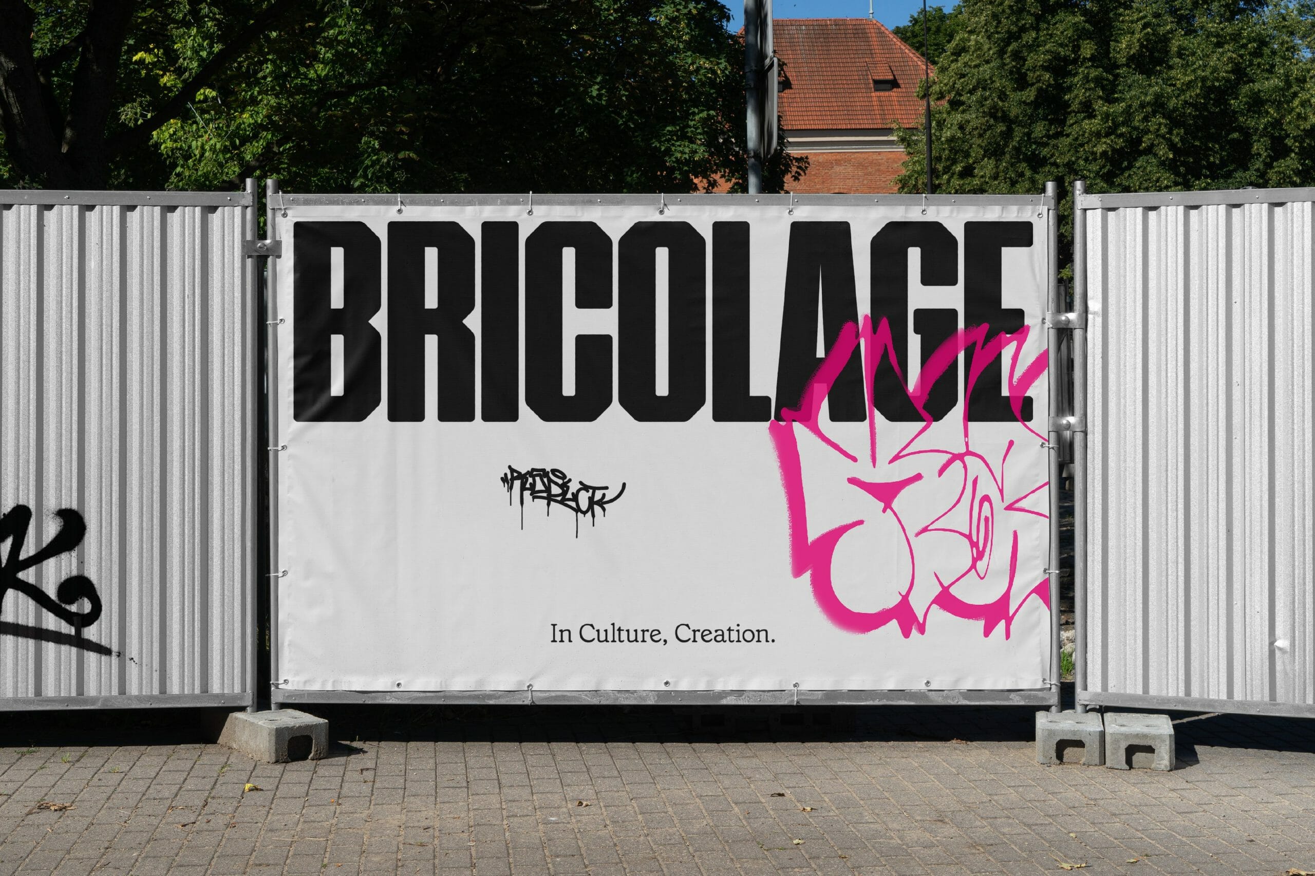
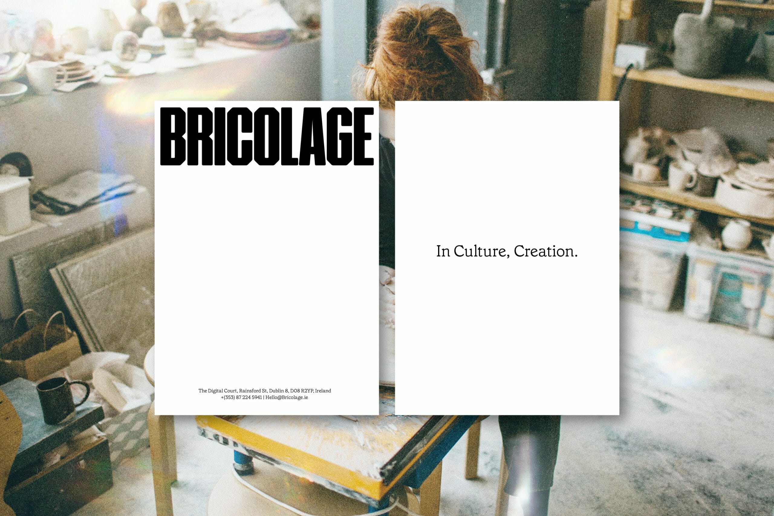
Bricolage
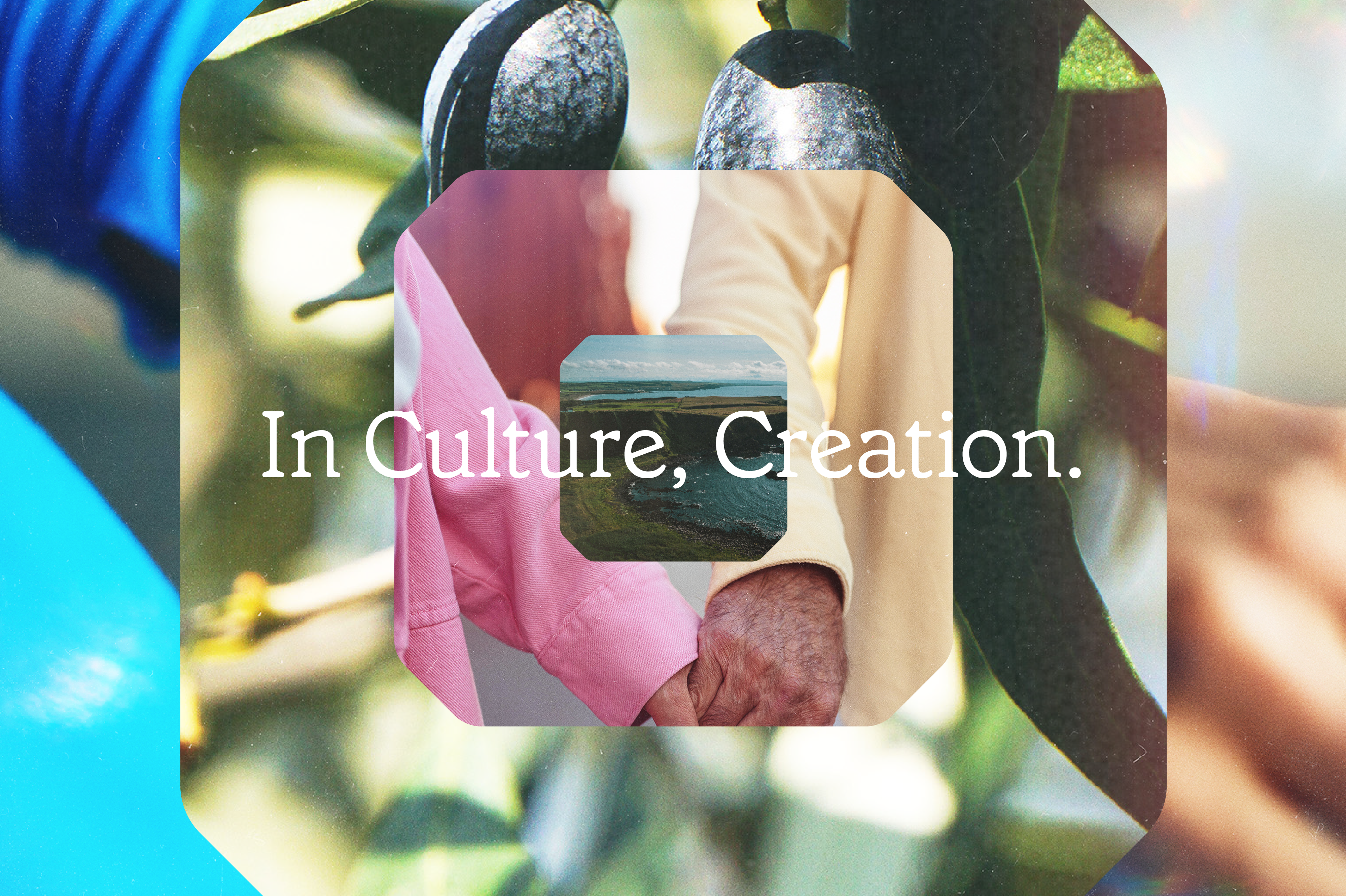
— In Culture, Creation.
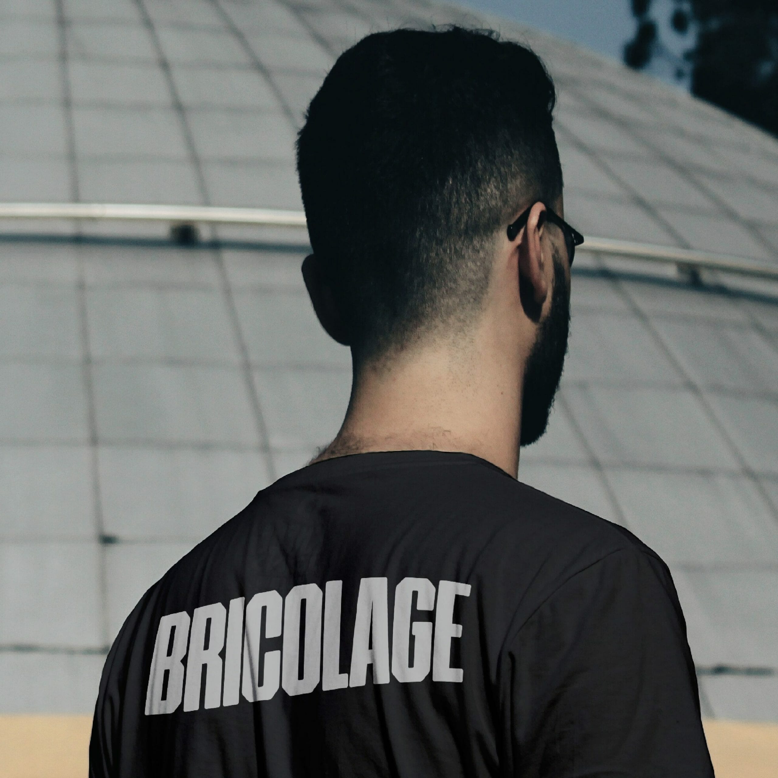
Bricolage is a cultural insights agency. Using human insights, living methodologies, and savvy strategy, they work in partnership with their clients to unearth authentic insights that deliver actionable strategy.
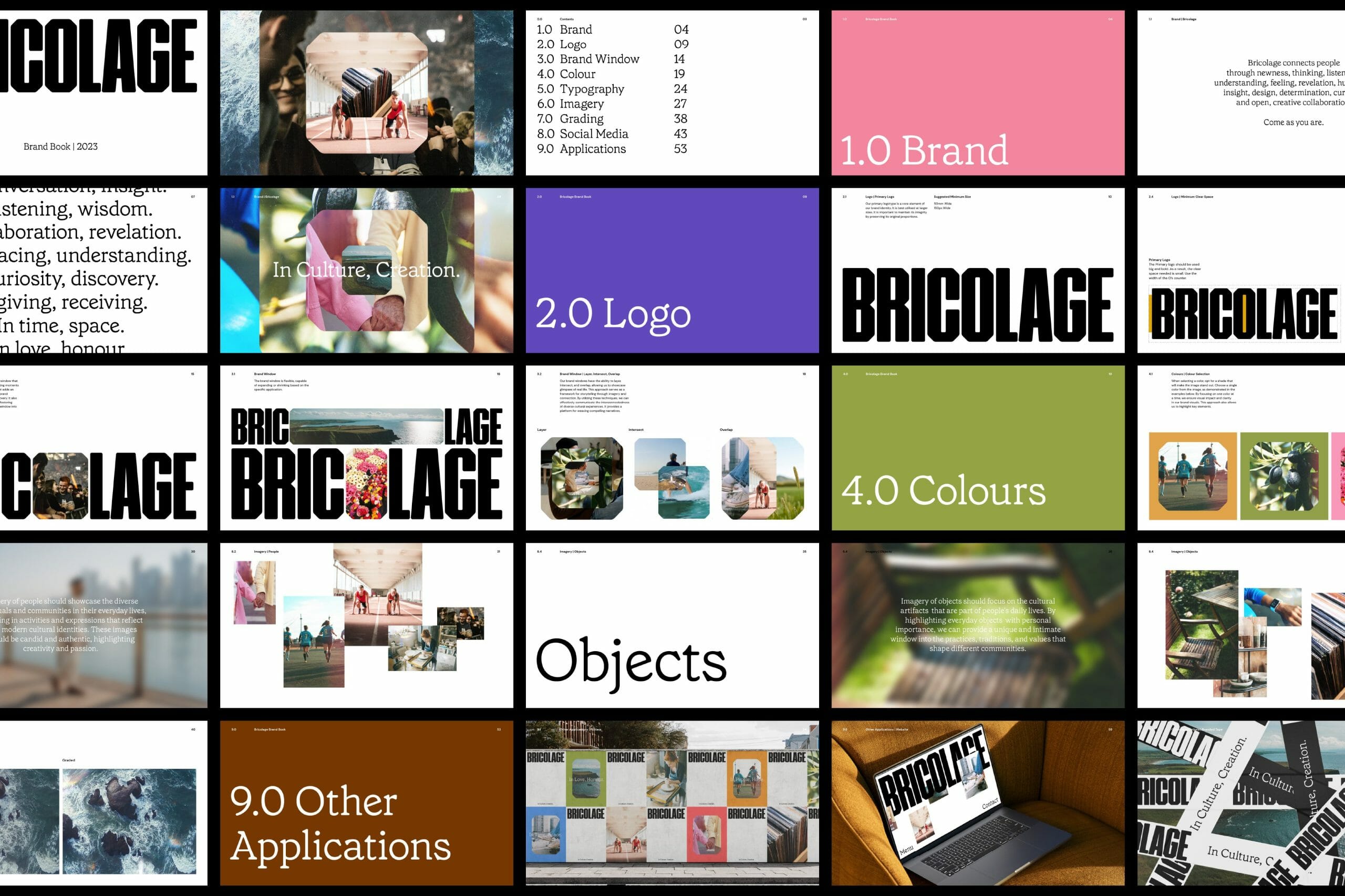
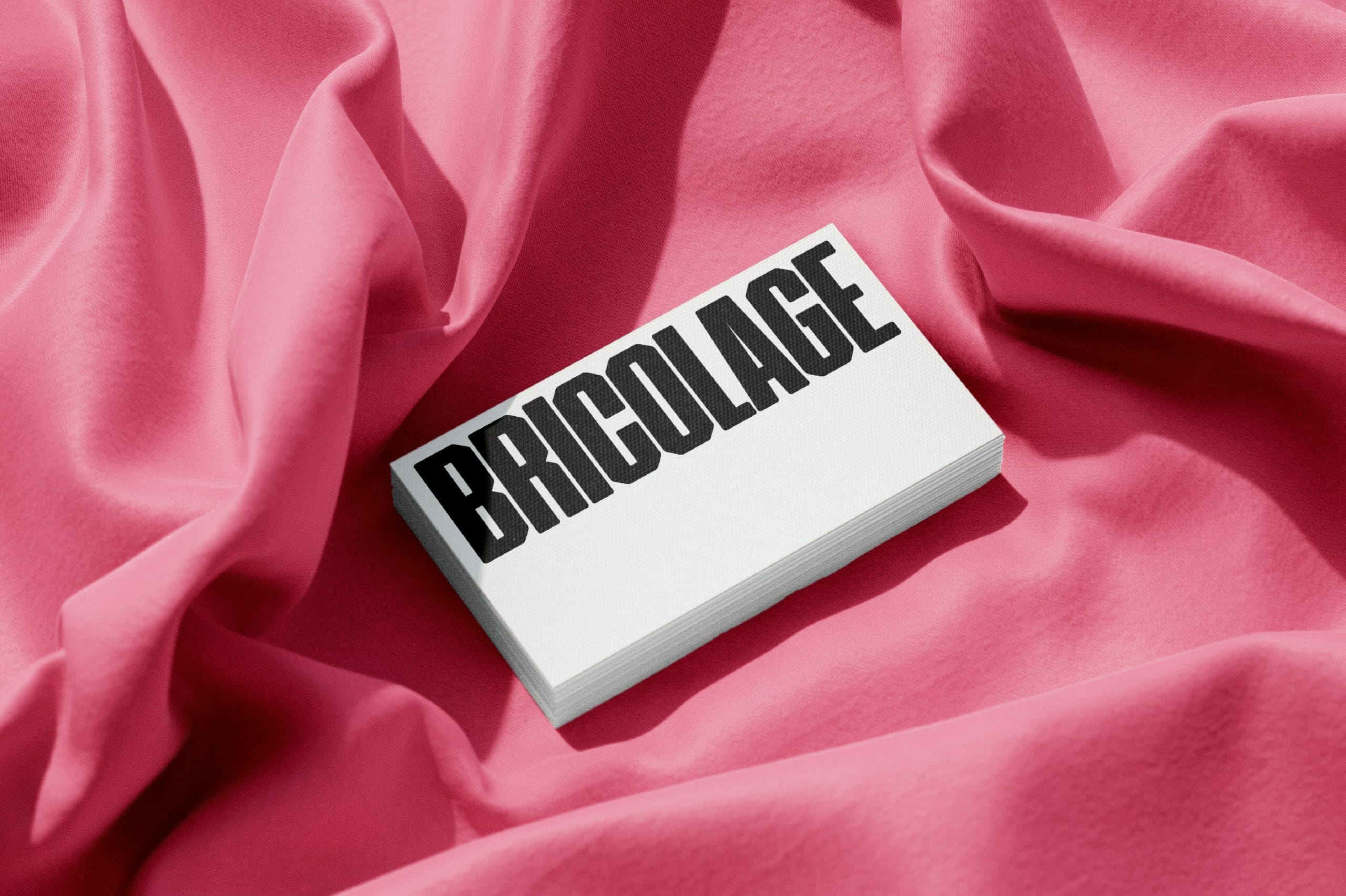
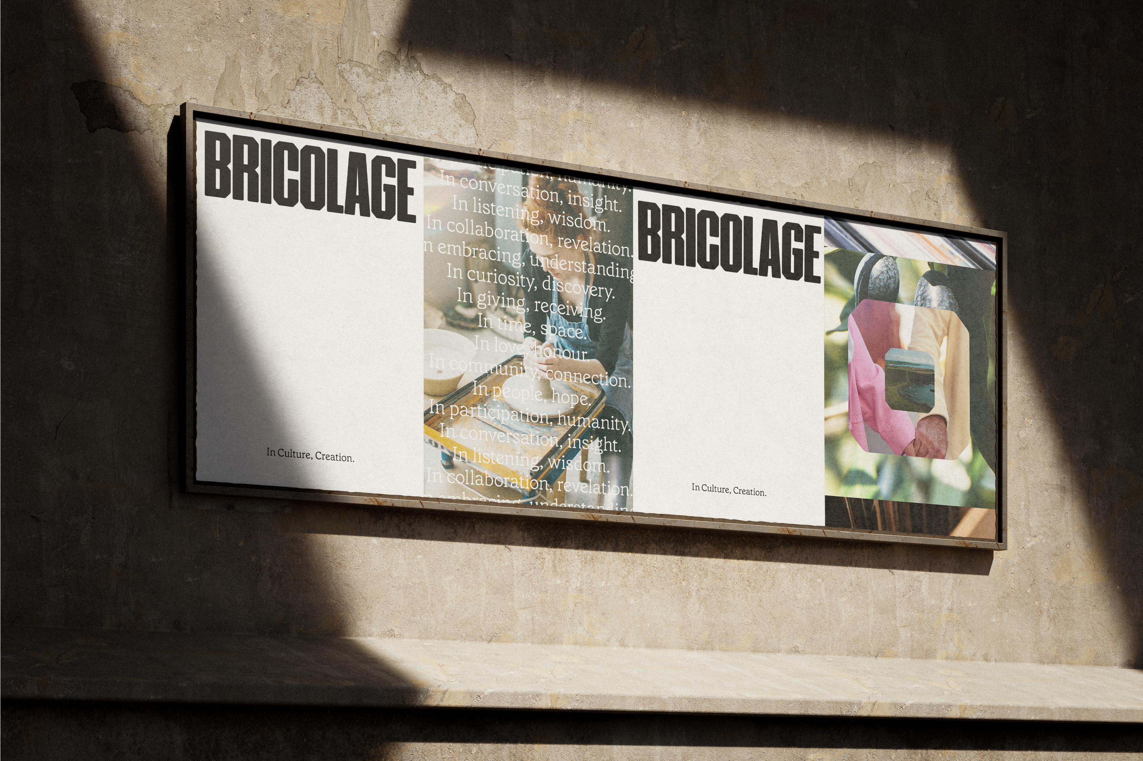
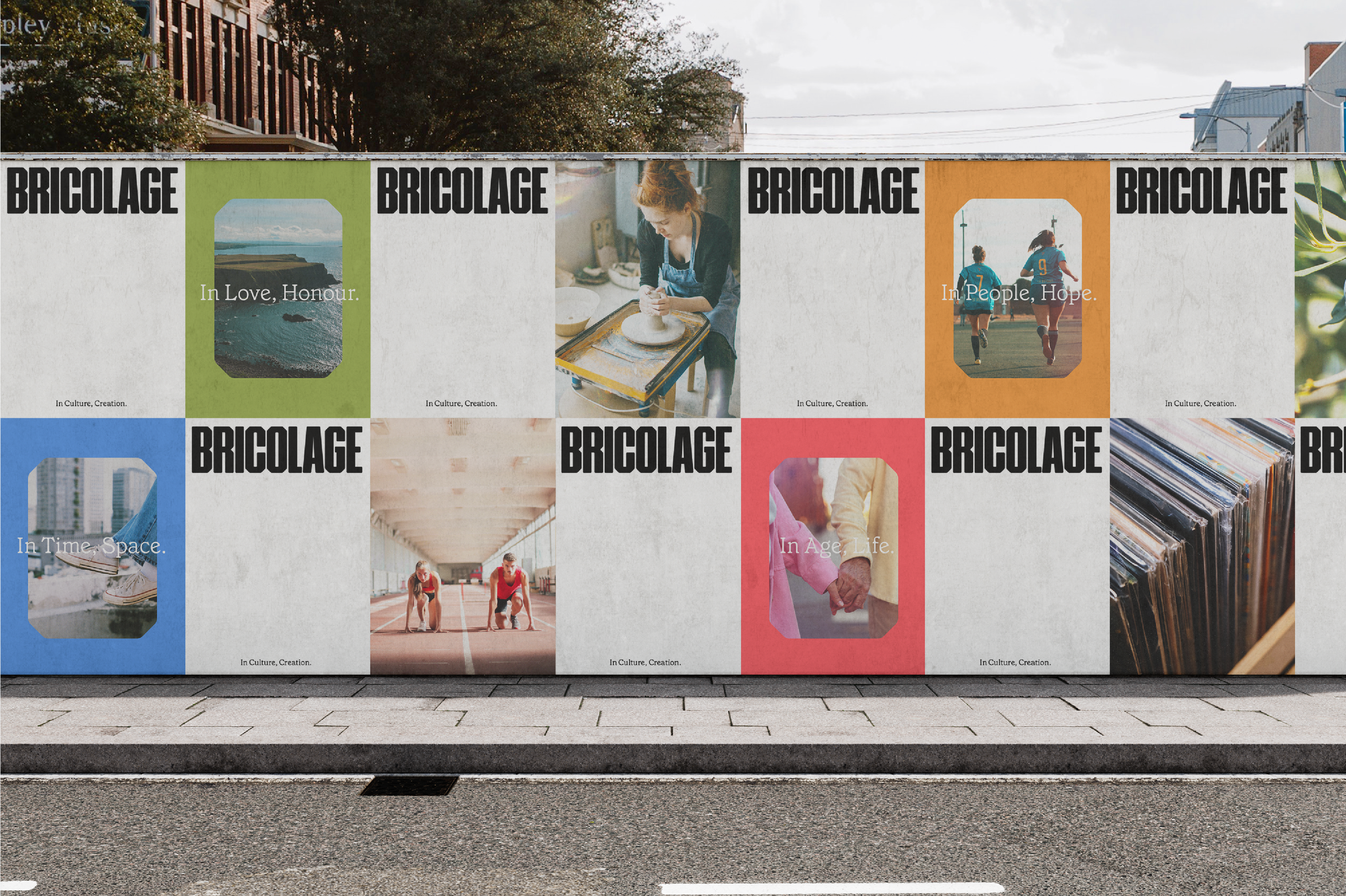
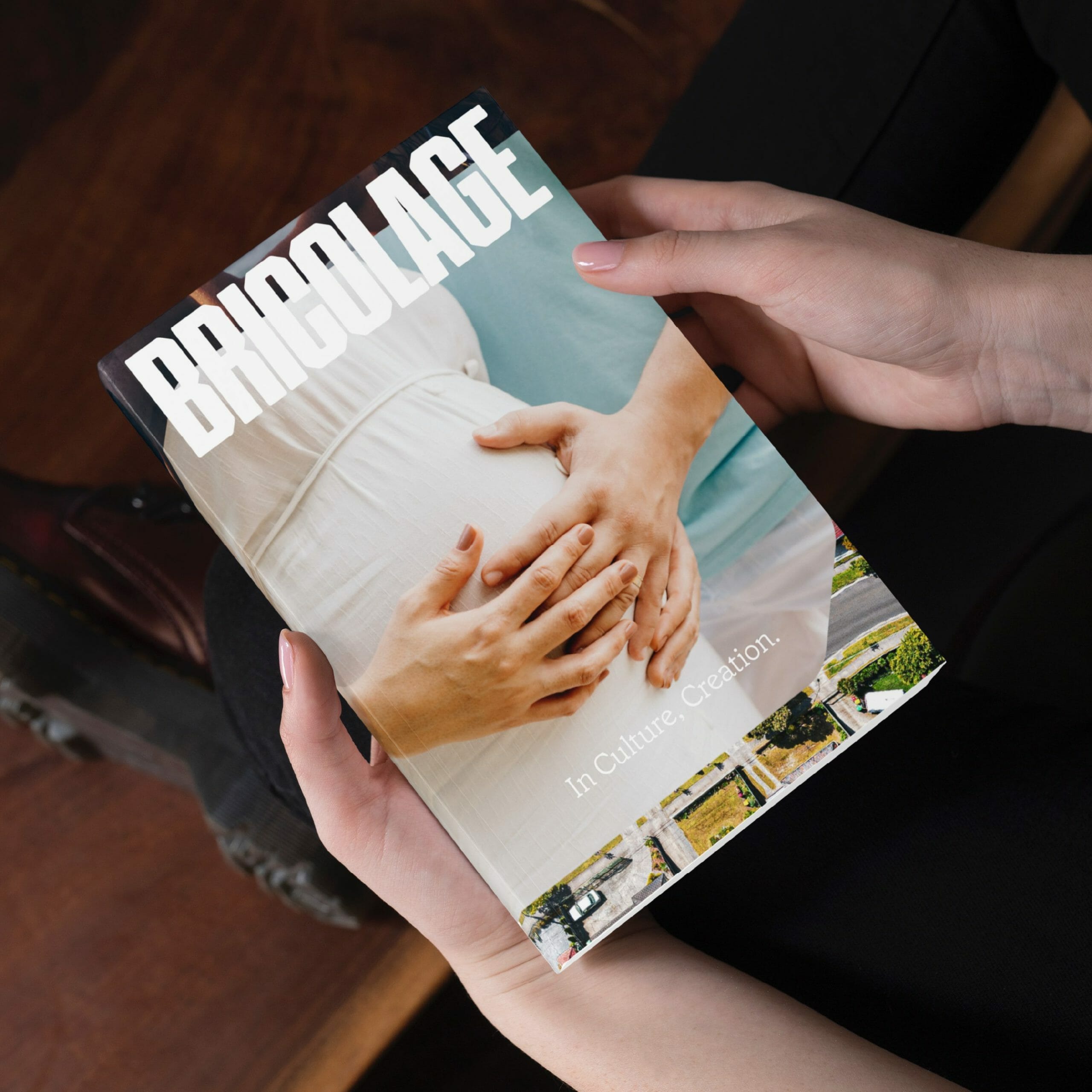
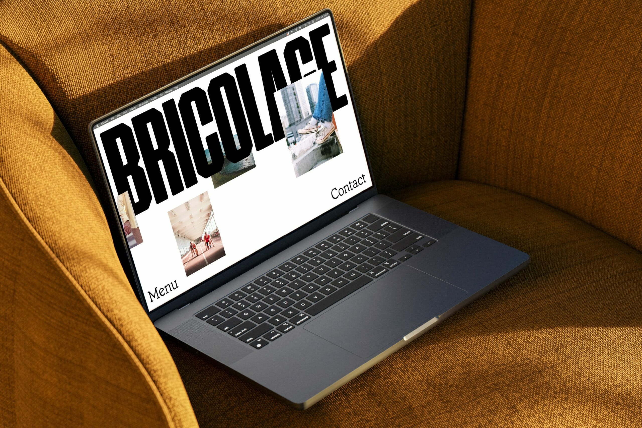
Our goal for Bricolage was to create a human-focused and future-facing brand. This was achieved through the use of a bold logo, human typography, and authentic imagery. The predominant use of white space represents a blank canvas with endless possibilities for creativity. However, Bricolage is a living brand that adapts to its environment. The colours used come directly from the imagery. This creates authenticity and visual cohesion, ensuring an ever-evolving brand presence.
The transformation of the 'O' in Bricolage into a window provides a glimpse into the interconnected web of culture, inviting exploration and discovery. These unique brand windows layer, intersect, and overlap, allowing us to showcase diverse real-life experiences and weave compelling narratives. Motion has been incorporated throughout the project to ensure a dynamic, future facing brand.
Scope
Brand Identity, Print Design,
Motion, Brand Guidelines
Collaborators
Jude Goulet -
Creative Strategy & Copy
SO STUDIO